





To begin, we analyze your audience's device usage and browsing behavior to inform our design decisions.
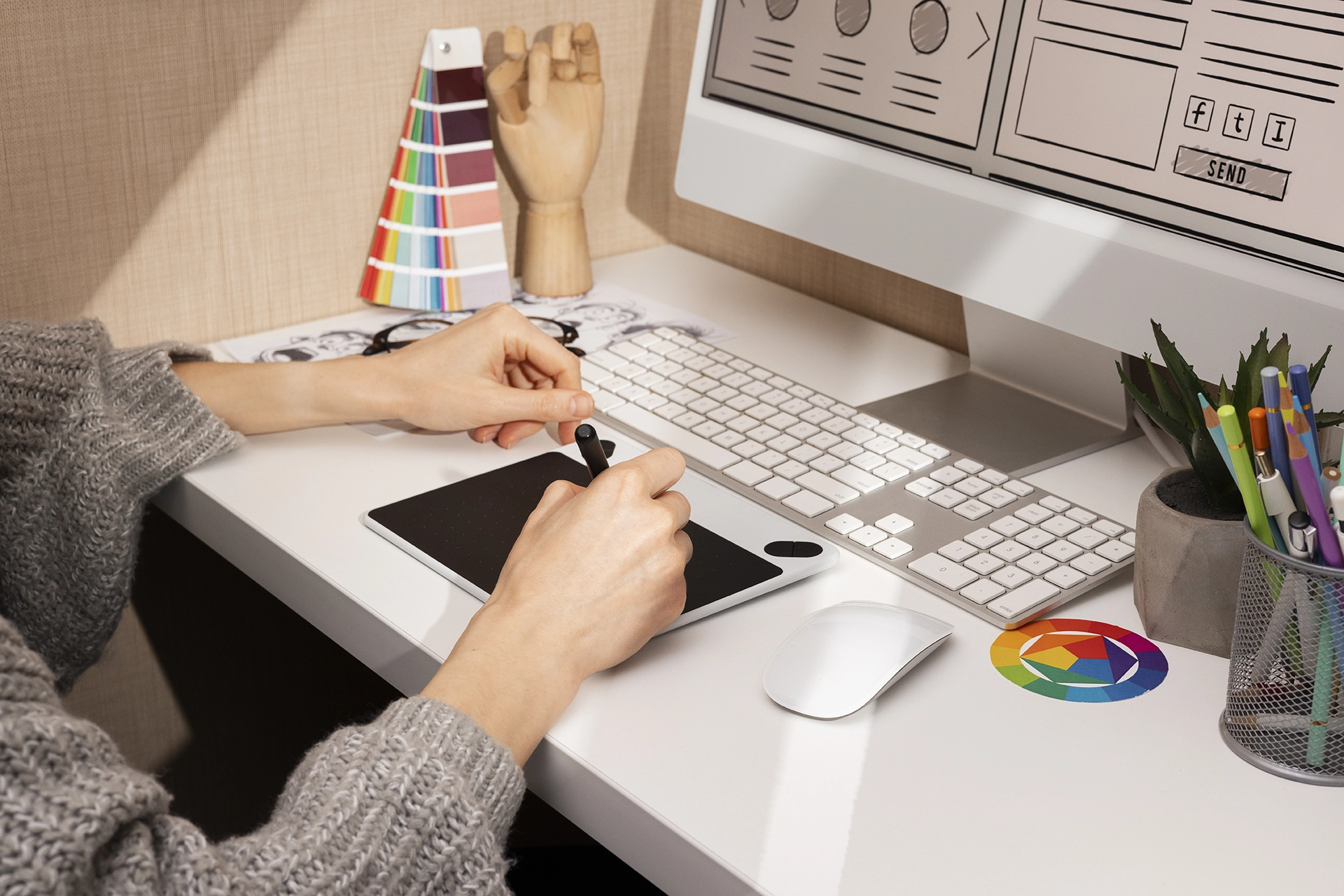
Next, we create wireframes for mobile screens first, then progressively enhance for larger devices.

Then, we design responsive mockups that maintain brand consistency across all screen sizes.

After that, we build your site using responsive CSS frameworks and touch-optimized interactions.

Following that, we test your site on real devices using BrowserStack to ensure perfect rendering everywhere.

Finally, we launch your responsive site and monitor performance across all device types.
If you cannot find the answer you are looking for, simply contact us at info@dxbwebdesigner.com and our design experts will be happy to help.